Answers to some of your Questions! (maybe)
Website Created May 2016, last updated 01 September 2021 Frequently Asked Questions, How to use and/or host your own Webfonts and more!
Frequently Asked Questions
-
What is the difference between a font and a typeface?
A typeface is what I design: The “face” of the type, so to speak. This can be done on paper, or in a computer program (I use Glyphs and Birdfont), or just about any other medium you can think of.
A font is then the digital manifestation of that typeface, something you can install on your computer or link into a website. A little file that contains the instructions for the computer how to render the letters I designed. (In the old times, a font would be the physical metal pieces that make up the letters).
-
Why does it matter which font is selected for a website?
A font or a typeface carries a lot of the “brand” you are trying to convey. You can think of this most obviously in some extreme examples: Think of Coca Cola of Walt Disney. Their (originally hand-lettered) Logos are easily distinguishable, even if they spelled out something else. Think of Marlboro (a font you can actually buy). Again, the recognition of the brand happens to some extend though the typeface. It’s kind of like with color: If you think of your school, most likely they had their own colors. Your favorite brands, are distinguishable through their color.
So in the same vein as color, choosing a font for your website is not something that should happen on a whim, because it can—subconsciously and consciously—change the look, feel and perception of your website. You should think about what fits your brand, something you want to convey, and then stick with it, and be consistent.
Most people do this intuitively when choosing which system font (the fonts that come pre-installed on your computer) they use. And while that is a great way to do it (I am a very intuitive artist myself), if you wish to set yourself apart, choose something a little more custom, so you can set yourself apart from others.
-
Why are fall backs important when designing a stylesheet? After all, the web is no longer a new thing. Do web pages ever really not load a font?
There are two parts to this question: The first one is in regards to something call the “font-stack”, a literal stack of CSS commands that look for a typeface, then, if not found, default to a different one, then, if not found, to a different one, etc. Does this really make sense if you are using webfonts? The answer is maybe.
Perhaps reading through Using Webfonts, Making Webfonts and Hosting Webfonts will clarify some confusions. But the short answer is that there is not one type of “webfont”. While a comprehensive web font package will include different file types that will render the font on a host of different systems (after all, the method to included fonts in websites has been around since CSS1!), there are so many different types of devices and browsers out there, that yes, there are still browsers that will not render all types of typefaces. Old Blackberry and Android browsers will not render the most common standard for web fonts, etc.
The other issue you may want to think about is loading time. Webfonts, especially if not subset (read more about that here), can be the size of a small image, so do you want your users be able to read the text right away, even if at first it doesn’t look like the typeface you want them to see? This has the downside that the page will reload, potentially reflow all the text when the web font does load. Or do you want the user to not be able to see the text until the resource, the web font has been loaded completely?
There are many ways to control and think about this, and there has much been written about this subject, and there is probably no correct answer.
-
I've read about free font offers found on the web. What makes this different from just using Verdana, Arial or Times New Roman on a stylesheet? Aren't those free too? Also, what is a “Google Web Font”?
Actually Verdana, Arial, Times New Roman and many other system fonts are not free at all. Your operating system provider has merely paid their licenses for you (or commissioned them). But they are, in a way, free to use for you. And in some instances, actually, a safer choice (see above). But think about the question of brand: If everybody looks like Arial, would you stand out? Would a standard font make you look more unique than a custom typeface, maybe even one you commissioned, one that only you use?
There are many free fonts online, and many of them good, many of them not so good (both from a technical and design aspect), and you should think about using them in the same way you should think about your brand. If it fits your brand well, why not use them?
Be careful though: Some fonts are free for personal, but not commercial use. Some fonts are free for desktop, but not for web use, and vice versa.
-
Also, what is a “Google Web Font”?
Google, like with anything internet related, provides a service that “serves up” free fonts for you to use on your website without having to host them on your own servers.
Remember loading times? Google Webfonts do have the advantage that their ubiquity makes them likely to be cached in your browser, maybe from visiting another website that used this typeface, so you may not have to wait for the font to load at all!
Aside from the selection (which can actually pretty good, depending on your needs), you are obviously using Google to host your fonts. Why might this be a problem? Google is a data-mining company. Because every computer pulling up your website also makes a call to Google to get the webfonts, Google knows which computer is accessing which website, at which time. Without even using Google! And let’s say you are managing a WordPress site that is using Google Webfonts: Because you are using a web-interface to edit and write, Google also knows who is editing which websites, at which time, from which computer. And because a lot of people are using Google Webfonts, Google can probably compile a pretty comprehensive browsing profile (a list of which websites a user visits), just from their web font hosting services alone. Sounds scary? Then read on…
-
How does one load/add a custom typeface to a web page?
Well, I have some dedicated sections on that!
-
Font mixing: is it bad to use more than one font on a website?
Of course not. The web is primarily typography: It’s written text, laid out in a hopefully legible, intelligible way for your readers read and comprehend quickly and efficiently. So everything people have been practicing in print-typography, generally can be applied to the web.
I recommend the book “Thinking with Type” by Ellem Lupton (pick up “Type on Screen” also while you’re at it!), which has some great introductory information on how to think about type and fonts. Previews are available on Google Books, and thinkingwithtype.com.
In general it can be said that when you combine typefaces, strive for contrast rather than similarities. Every typeface should have a role to play. You can use a different typeface where you normally accentuate using bold or italic type: In headlines, in footnotes, in an aside, etc.
As with anything, you can also consciously decide to break these rules, but I highly recommend to understand them first, so you can break them with a purpose! :)
-
Hey, I see “Die Blockschrift” … Why did you kill the Blockschrift?
Die is just the female article that would translate into “the” in German. Us Germans like to put articles on things. And Schrift is a female word.
-
I see! And Schrift means…
…font, type, and writing in German.
-
So you are …
German.
Using Webfonts
So you decided that web fonts is what you want! (Good for you!) But where to start?
The simplest way is to outsource the job, and simply use the font by calling it in CSS like you would with any system font or font on your computer.

That’s it? Well not quite. The font has to come from somewhere, doesn’t it? Some services make it incredibly simple: You pay for someone to host the font you want, or opt for a free service. Then all you have to do is add a stylesheet to the header of your website that then does all the work for you!

This basic process applies to all methods of using webfonts. Tell your website from where to get the font, and then start using it in your CSS like any other font!
Make Webfonts
Let’s say you can’t find the font you want on Google Webfonts. Or you looked at fonts online and you found one that you really, really like, and you can’t buy it at a web font provider. Maybe you had a typeface commissioned, or even designed one yourself!
What next?
Well, first of all, make sure your font is eligible to be turned into a webfont. Fonts are licensed software, and the maker of the font may not want you to use it as webfont. In fact, there is much controversy on the issue, but the bottom line is, if it’s not allowed, it’s not allowed. After all, you paid for license of the font, you don’t own the rights to it, just like buying a copy of a song does not mean you own that song now.
But let’s say you found a great free font, and the owner is totally okay with you using it on the web. Or you actually do own the font, because you had somebody make it for you (hint hint), or, even better, you made it yourself!
The Basics
This is the tricky part: There is not one format for fonts. There is especially not just one format for webfonts. The basics are:
- .ttf — True Type Format. Most fonts on your computer are this format
- .woff and .woff2 — Web Open Font Format: I wish all browsers supported this format, but they don't.
- .eot — Embedded Open Type. Can you guess for which … “special” browser we need this format?
- .svg — Scalable Vector Graphics. These are basically images.
Most likely you will need some, all, or at least the most common one of these file types to make your webfont work in most browsers. Of course, most of the time, you may just have one, or none at all.
Font Squirrel to the rescue!
I will point out that Font Squirrel is not the only service that will allow you to turn a font into a webfont, but it is by far the most comprehensive in my opinion. Let’s walk through the process we need to turn this font into a webfont:
We are go going to start with this typeface I made. It’s called Kambri, and I happen to need only three weights: Regular, Hairline and Bold. We start by loading the font to Font Squirrel
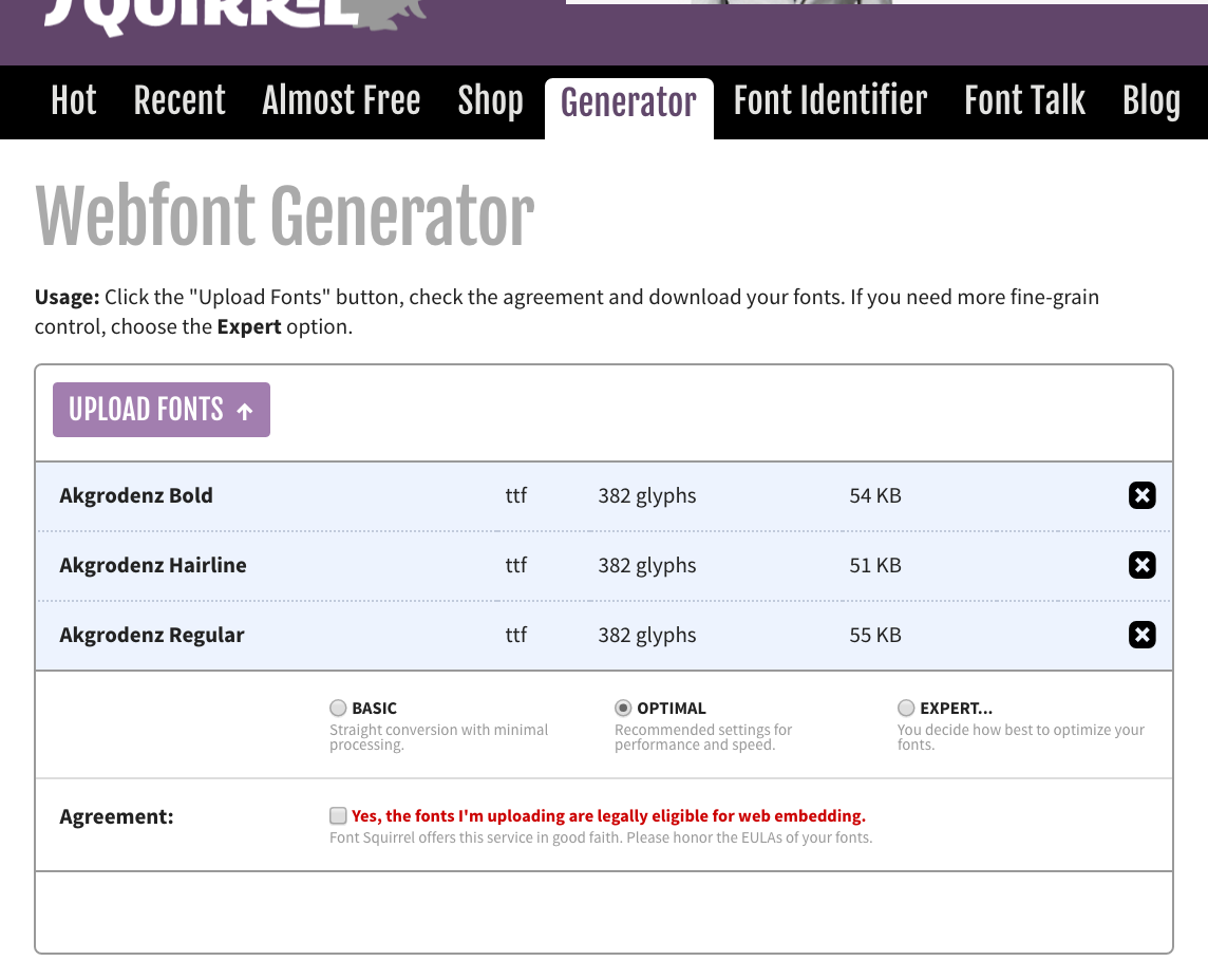
Are done now? Maybe. And if your needs are basic, you might be. You could just download the file in the optimal settings, but let me show you that diving in a little deeper can actually be beneficial for you:

The first thing we are going to see when we click that expert knob is which filetypes we want to use. For the sake of this demonstration, I am going to check TTF, WOFF and EOT Compressed. There are good reasons for checking a different set, like not checking TTF or chasing WOFF2 over WOFF, or leaving both, but we are going to go along with this method for now.
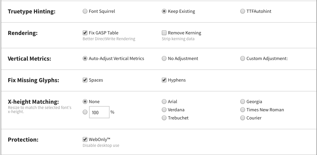
“Hints” are instructions to the renderer (the browser, your computer, a printer) to render certain letters a certain way when the resolution is low. I usually keep my own, but I’m sure Font Squirrel does a fine job, too. There is much to talk about regarding hints, but again, we are going to go the Keep Existing for the sake of this demonstration.
I would recommend keeping the Auto-Adjust Vertical Metrics checked. Different OSs, different renderers, different results (warning, your head may explode). This will try to make it somewhat cross platform consistent. Results may vary, though…
I also recommend not to do any X-Height Matching. (The X-Height is the height of the small letters. This can vary dramatically between fonts, and you can see it in an example in my own NEUE Mogobau typeface). After all, we can are going to design our website with that in mind, right? (Right?!)
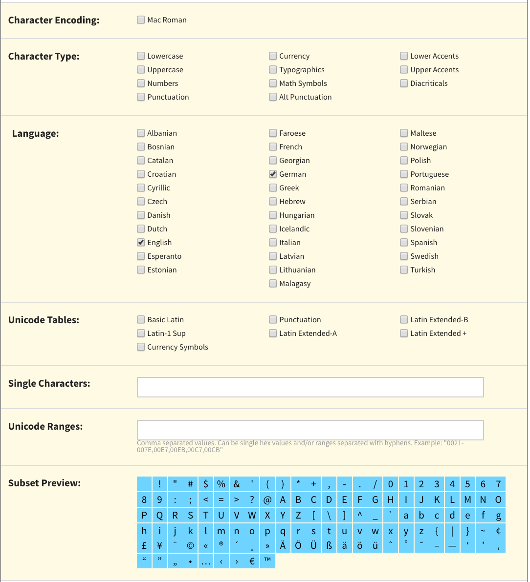
This is my favorite, and probably the most important section, because it directly effects file-size and therefore loading times. Subsetting allows you to chose which characters are included in your font. If you know that your page is in, say, English and German, you probably don't need all the extra special character with the funny little lines on top and underneath (called Diacritics). So you can tell Font-Squirrel to take them out. If your typeface supported, say, 12 languages, you can make quite a difference in terms of filesize!
Neat enough, but better yet, you can even see which characters will be included in your typeface, just to make sure you don’t want to spell crème after all.
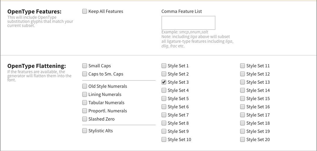
So this is where you might gloss over, but if you know what open type is (and you are not afraid not all browsers support the feature you want), you can chose it here. For the sake of this example, I chose not to include any OpenType features, but I do know that I designed Style Set 3 to included rounded dots instead of square ones in all letters and punctuations. I want this “flattened” into my font, meaning that I want this styleset to replace the regular style set (square dots) in my webdont. Checking this box will give me a webfont with rounded dots instead of the square ones I would have gotten, had I not checked this.

One of my other favorite features is Base64 encoding. This basically encodes the entire typeface file (the WOFF version in this case) into the CSS itself. That means that the browsers does not have to make another GET request to fetch another file, it’s already in the CSS. This also helps if you would like to protect the typeface from easily being extracted from your website (though it is still technically possible…).
The cool thing here is, if you know that the only browsers you need to support can work with this feature (let's say you are making an iOS-only website), all you’d need to do is include this one CSS file and that is it! No other files needed!
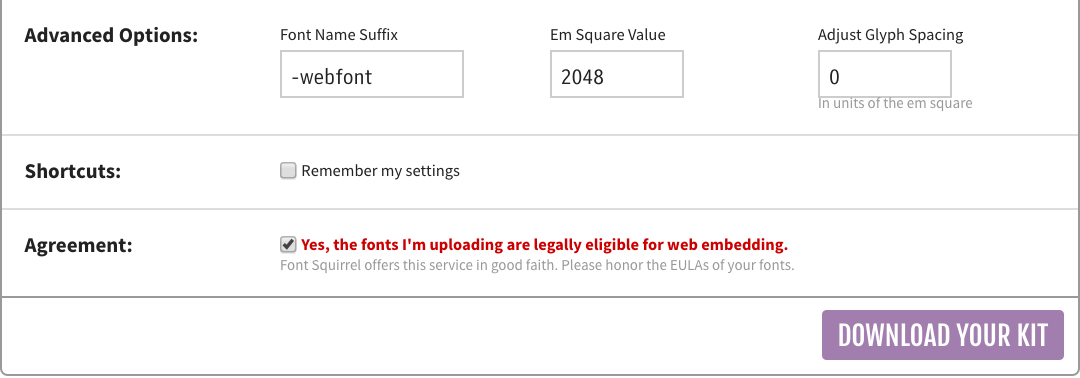
But as you may have gather from this explanation, in most cases, you will get more than one file. Let’s take a look at what we get:

These are the contents of the ZIP file we just downloaded. We get an EOT, a WOFF and a TTF file for all the weights we uploaded, as well as a CSS sheet, some specimen and some other stuff. We don’t need all of it. In fact, let’s get rid of a few things.
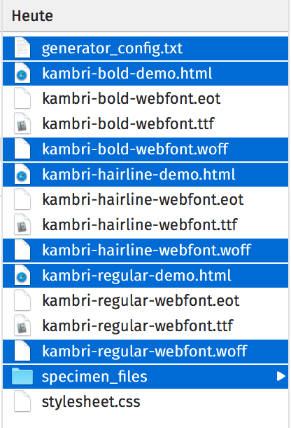
Wait, why am I deleting the WOFF files? Well, looking at our style sheet will tell us why:
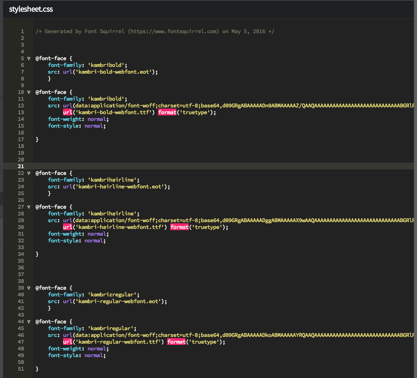
This loooooooong line staring with (data:application … ), that’s out WOFF file, sitting in our CSS! Cool!
So done now? Not quite. I recommend a few changes still:
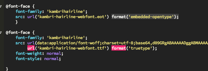
You will notice your font-weights come in pairs: One .eot part, and one “all others” part. Add the following to the end of the line that has the .eot file: format('embedded-opentype');. This small hint should help some browsers, you may notice that the .ttf file has a line like this by default.

If you notice, up until this point, all the weights in the stylesheet had their own names. The Bold version of Kambri was called kambribold, the regular kambriregular, etc. That’s fine, if you want to use bold text, you would just have to state your font-family to ‚kambribold‘ in your CSS, but that’s not how real webfonts work. You want to be able to just declare your font-family once, as Kambri, and then use b or strong as expected.
So first, let’s change the font-family name to whatever we want to, in this case simply Kabri for all declarations of the same, in this case 6 times.
(Note: Font Squirrel does offer this style-linking, but it doesn’t always work flawlessly.)

You may have noticed we now have three instances of a Font called Kambri, and all are the font-weight: normal. Uh-oh, that’s not what we want. So let’s change that. For the Hairline weight, we are going to change it to 100, for Bold to Bold (or 700) and for regular to normal (or 400).
Caution: Copy the font-weight and font-style declarations from the bottom part of the pair to the top part of the pair. You want both parts of the pair to end in the same way as in the screenshot above.
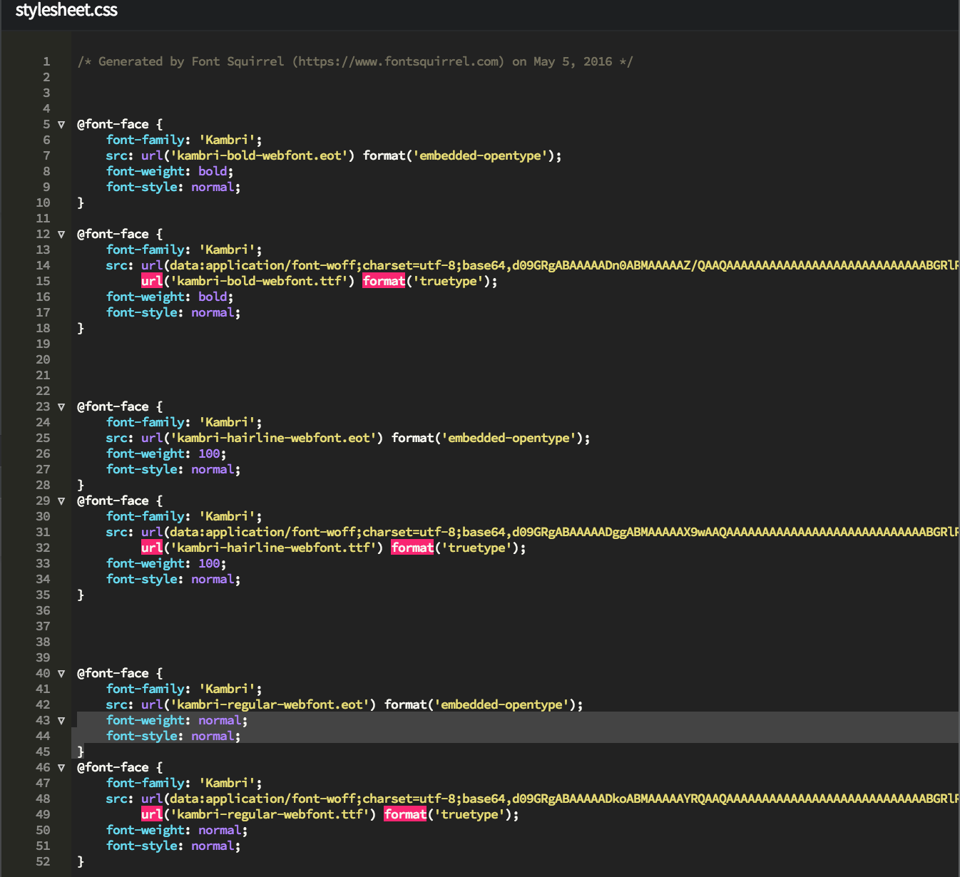
Once you are done, you will have a fully functional, relatively cross-browser compatible webfont setup, that you can now use and host them on your website!
(phew!!!!)
Hosting your Webfonts
Generally speaking, you would simply upload your files on your server and link the webfont stylesheet accordingly.
But a few words of wisdom at the end:
- Don’t include more than you have to. Think about which weights you need, and only include those. read this and think about subsetting your font, using only the parts that you need.
- If you have more than one web project on your server, you may not want to host the font in every project, as it would just be redundant. It would be nice to have it one central place. This is where webfont services actually come in very handy.
- If you don't want to pay for such a service, you can consider hosting them in once central location and then linking each page to that location. But CAUTION. Most servers will have a same origin policy and now allow you to include resources that are not hosted in the same server. Or rather, that server does not allow its resources to be included on another host. You can however, do an online search on how you can change this behavior, like, on apache, modifying you .htaccess files. (to included something like this):
Header set Access-Control-Allow-Origin "*"
Careful: If you don’t know what you are doing, please contact your hosting service provider, and realize that if you allow this, anybody on the web can theoretically do the same thing and really cause your servers bandwidth to suffer. You may chose to only allow certain sources, instead of all.