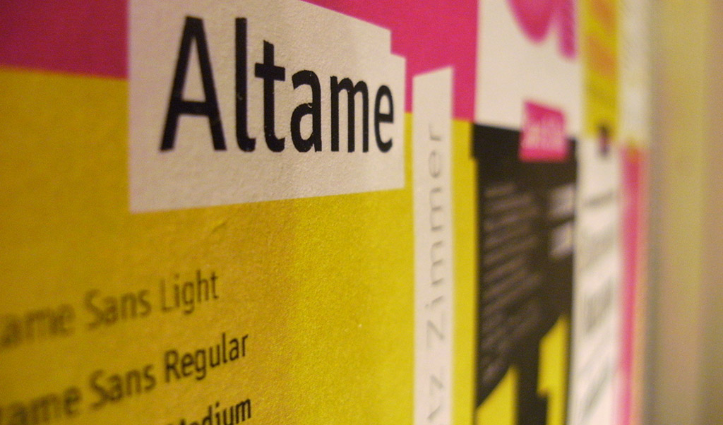
The Altame Family
Typeface Created June 2015, last updated 01 September 2021 Altame was devised as the home type- face for a website and blog project in early 2015, and has since evolved into a family with different styles and weights. It was designed to get a lot of text in relatively small spaces on screen, while maintaining a certain look and feel: Something that is contemporary—not timeless. Functional, condensed, square, a little German, and legible. (read more here)
Altame

Downloadable / Web Specimen
Try it out!
italic A A A A A AIf you have a modern browser, you can see the webfont of this typeface in action! Manipulate the slider to set the text size, and use the dropdown menu to select a weight. You can also click on the text and write your own! If your browser does not support this technology, you can still go to the specimen tab for more downloadable samples of this typeface.
Sample Text
Colum Count:
Lorem ipsum dolor sit amet, consectetur adipiscing elit. Integer nec odio. Praesent libero. Sed cursus ante dapibus diam. Sed nisi. Nulla quis sem at nibh elementum imperdiet. Duis sagittis ipsum. Praesent mauris. Fusce nec tellus sed augue semper porta. Mauris massa. Vestibulum lacinia arcu eget nulla.
Class aptent taciti sociosqu ad litora torquent per conubia nostra, per inceptos himenaeos. Curabitur sodales ligula in libero. Sed dignissim lacinia nunc. Curabitur tortor. Pellentesque nibh. Aenean quam. In scelerisque sem at dolor. Maecenas mattis. Sed convallis tristique sem. Proin ut ligula vel nunc egestas porttitor. Morbi lectus risus, iaculis vel, suscipit quis, luctus non, massa.
Fusce ac turpis quis ligula lacinia aliquet. Mauris ipsum. Nulla metus metus, ullamcorper vel, tincidunt sed, euismod in, nibh. Quisque volutpat condimentum velit. Class aptent taciti sociosqu ad litora torquent per conubia nostra, per inceptos himenaeos. Nam nec ante. Sed lacinia, urna non tincidunt mattis, tortor neque adipiscing diam, a cursus ipsum ante quis turpis. Nulla facilisi. Ut fringilla. Suspendisse potenti. Nunc feugiat mi a tellus consequat imperdiet.
Vestibulum sapien. Proin quam. Etiam ultrices. Suspendisse in justo eu magna luctus suscipit. Sed lectus. Integer euismod lacus luctus magna. Quisque cursus, metus vitae pharetra auctor, sem massa mattis sem, at interdum magna augue eget diam. Vestibulum ante ipsum primis in faucibus orci luctus et ultrices posuere cubilia Curae; Morbi lacinia molestie dui. Praesent blandit dolor. Sed non quam. In vel mi sit amet augue congue elementum. Morbi in ipsum sit amet pede facilisis laoreet.
Donec lacus nunc, viverra nec, blandit vel, egestas et, augue. Vestibulum tincidunt malesuada tellus. Ut ultrices ultrices enim. Curabitur sit amet mauris. Morbi in dui quis est pulvinar ullamcorper. Nulla facilisi. Integer lacinia sollicitudin massa. Cras metus. Sed aliquet risus a tortor. Integer id quam. Morbi mi.
Quisque nisl felis, venenatis tristique, dignissim in, ultrices sit amet, augue. Proin sodales libero eget ante. Nulla quam. Aenean laoreet. Vestibulum nisi lectus, commodo ac, facilisis ac, ultricies eu, pede. Ut orci risus, accumsan porttitor, cursus quis, aliquet eget, justo. Sed pretium blandit orci. Ut eu diam at pede suscipit sodales. Aenean lectus elit, fermentum non, convallis id, sagittis at, neque. Nullam mauris orci, aliquet et, iaculis et, viverra vitae, ligula. Nulla ut felis in purus aliquam imperdiet. Maecenas aliquet mollis lectus.
Vivamus consectetuer risus et tortor. Lorem ipsum dolor sit amet, consectetur adipiscing elit. Integer nec odio. Praesent libero. Sed cursus ante dapibus diam. Sed nisi. Nulla quis sem at nibh elementum imperdiet. Duis sagittis ipsum. Praesent mauris. Fusce nec tellus sed augue semper porta. Mauris massa. Vestibulum lacinia arcu eget nulla. Class aptent taciti sociosqu ad litora torquent per conubia nostra, per inceptos himenaeos.
Curabitur sodales ligula in libero. Sed dignissim lacinia nunc. Curabitur tortor. Pellentesque nibh. Aenean quam. In scelerisque sem at dolor. Maecenas mattis. Sed convallis tristique sem. Proin ut ligula vel nunc egestas porttitor. Morbi lectus risus, iaculis vel, suscipit quis, luctus non, massa. Fusce ac turpis quis ligula lacinia aliquet.
Character Set
!
!"
"#
#$
$%
%&
&'
'(
()
)*
*+
+,
,-
-.
./
/0
01
12
23
34
45
56
67
78
89
9:
:;
;<
<=
=>
>?
?@
@A
AB
BC
CD
DE
EF
FG
GH
HI
IJ
JK
KL
LM
MN
NO
OP
PQ
QR
RS
ST
TU
UV
VW
WX
XY
YZ
Z[
[\
\]
]^
^_
_`
`a
ab
bc
cd
de
ef
fg
gh
hi
ij
jk
kl
lm
mn
no
op
pq
qr
rs
st
tu
uv
vw
wx
xy
yz
z{
{|
|}
}~
~¡
¡¢
¢£
£¤
¤¥
¥¦
¦§
§¨
¨©
©ª
ª«
«¬
¨
®¯
¯°
°±
±²
²³
³´
´¶
¶·
·¸
¸¹
¹º
º»
»¼
¼½
½¾
¾¿
¿À
ÀÁ
ÁÂ
ÂÃ
ÃÄ
ÄÅ
ÅÆ
ÆÇ
ÇÈ
ÈÉ
ÉÊ
ÊË
ËÌ
ÌÍ
ÍÎ
ÎÏ
ÏÐ
ÐÑ
ÑÒ
ÒÓ
ÓÔ
ÔÕ
ÕÖ
Ö×
×Ø
ØÙ
ÙÚ
ÚÛ
ÛÜ
ÜÝ
ÝÞ
Þß
ßà
àá
áâ
âã
ãä
äå
åæ
æç
çè
èé
éê
êë
ëì
ìí
íî
îï
ïð
ðñ
ñò
òó
óô
ôõ
õö
ö÷
÷ø
øù
ùú
úû
ûü
üý
ýþ
þÿ
ÿĀ
Āā
āĂ
Ăă
ăĄ
Ąą
ąĆ
Ćć
ćĊ
Ċċ
ċČ
Čč
čĎ
Ďď
ďĐ
Đđ
đĒ
Ēē
ēĖ
Ėė
ėĘ
Ęę
ęĚ
Ěě
ěĞ
Ğğ
ğĠ
Ġġ
ġĢ
Ģģ
ģĦ
Ħħ
ħĪ
Īī
īĮ
Įį
įİ
İı
ıĶ
Ķķ
ķĹ
Ĺĺ
ĺĻ
Ļļ
ļĽ
Ľľ
ľŁ
Łł
łŃ
Ńń
ńŅ
Ņņ
ņŇ
Ňň
ňŊ
Ŋŋ
ŋŌ
Ōō
ōŐ
Őő
őŒ
Œœ
œŔ
Ŕŕ
ŕŖ
Ŗŗ
ŗŘ
Řř
řŚ
Śś
śŞ
Şş
şŠ
Šš
šŢ
Ţţ
ţŤ
Ťť
ťŦ
Ŧŧ
ŧŪ
Ūū
ūŮ
Ůů
ůŰ
Űű
űŲ
Ųų
ųŴ
Ŵŵ
ŵŶ
Ŷŷ
ŷŸ
ŸŹ
Źź
źŻ
Żż
żŽ
Žž
žƒ
ƒȘ
Șș
șȚ
Țț
țˆ
ˆˇ
ˇ˘
˘˙
˙˚
˚˛
˛˜
˜˝
˝̀
̀́
́̂
̂̃
̃̄
̄̆
̆̇
̇̈
̈̊
̊̋
̋̌
̌̒
̦̒
̧̦
̧̨
̵̨
̵̶
̶̷
̷̸
̸Δ
ΔΩ
Ωμ
μπ
πẀ
Ẁẁ
ẁẂ
Ẃẃ
ẃẄ
Ẅẅ
ẅẞ
ẞỲ
Ỳỳ
ỳ–
–—
—‘
‘’
’‚
‚“
“”
”„
„†
†‡
‡•
•…
…‰
‰‹
‹›
›⁄
⁄€
€™
™⅐
⅐⅑
⅑⅒
⅒⅓
⅓⅔
⅔⅕
⅕⅖
⅖⅗
⅗⅘
⅘⅙
⅙⅚
⅚⅛
⅛⅜
⅜⅝
⅝⅞
⅞⅟
⅟↉
↉←
←↑
↑→
→↓
↓↔
↔↕
↕↖
↖↗
↗↘
↘↙
↙∂
∂∅
∅∏
∏∑
∑−
−√
√∞
∞∫
∫≈
≈≠
≠≤
≤≥
≥◊
◊◼
◼fi
fifl
flffi
ffiffl
fflThe Altame Story
Altame was devised as the home typeface for a website and blog project in early 2015, and has since evolved into a family with different styles and weights. It was designed to get a lot of text in relatively small spaces on screen, while maintaining a certain look and feel: Something that is contemporary-not timeless. Functional, condensed, square, a little German, and legible.

This current decade, "Egyptian" slab-style Serifs seemed to have been in vogue, and I wanted a typeface that lived very much in the now. Something I could look back onto twenty years from now and think:
That's so 2010s. Sans and Slab versions developed hand in hand from the beginning. An idea on the Sans would work well on the Slab, the Slab would take a new direction which was adapted on the Sans, etc.
The Starting point for Altame was a series of drawings I did after playing around setting web pages in a typeface called Jura. I soon realized I wanted something more narrow, more square, and stiffer. Working from Jura, and many other typefaces I liked, I drew and redrew Altame at least two dozen different times, until I had something I really, really liked. The design ended up being influenced by a number of other typefaces: A condensed Frutiger for the simple humanist shapes of many letters, Polo or FF Meta for its angled terminals, the Aldi typeface for its more squared resolve of round shapes. Perhaps more subconsciously, Clearview inspired some of the letter shapes as well.
Currently, Altame Sans and Altame Slab support the Western European and Central European Latin Character Sets, basic ligatures, as well as four sets of numbers: proportional old style and ligatures, and their tabular equivalents.
The name Altame (All-tah-meh) didn't come out of nowhere, and as follows will be the...
History of the name:
The first versions of the typeface were called (with its origins being somewhat conceited) "Zettwiezimmer". After many revisions, I eventually ended up with names like "Zettwiezimmer Zwei Alternate Sans Regular Bold"-not exactly catchy, nor functional. So I shortened it "Alt" for development purposes. Because it is my first complete typeface development, I played around with the thought of possibly naming the typeface Altama, for "Alt Amateur".
An Internet search quickly destroyed that thought: I have and wish no association with the company that operates under that name.
Plus showing it to a few people, everyone seemed to always want to read "Alabama", also not something I am associated with. So the last step was to play with the vowels until I had something that sounded cool, was unique and looked nice. Since the lowercase "a" and "e" very much define the feel of the typeface in general, what could have been a better "t" than: "Altame".
Das i-Tüpfelchen:
I like round dots. But I also like square things. The dots should seem natural, and flow out of the feel of the typeface. And so, I decided to really work this one out: I started with the shape of the curves on the rounded letters, them- selves squared off slightly, and worked the circle slowly into a square, stopping somewhere in between. (Think super-ellipse!). The lowercase "i" also has a hint of a serif on it, but it did not always. Originally, the "i" bent inwards, but in favor of minimizing noise, it received a serif instead.
Let's talk italics! I was not particularly interested in making an italic version for this typeface at first. If I needed an italicized font, I would just oblique it. But once I did start to play around with the idea of an italic, what a great opportunity it was to add another voice to the Altame Family! If the purpose of any italic is to add noise, differentiation and contrast to a text, I decided to take it as an opportunity to play around with shapes that make Altame even squarer (without outright doing so), and elaborate on some of the ideas in some of the shapes.