Die Blockschrift
Typeface Created February 2016, last updated 01 September 2021 Die Blockschrift is my version of the 1897 font “Blockschrift” from the Genzsch & Heyse type foundry. (read more here)
It is also the typeface of choice for this website’s home page!
Die Blockschrift

Downloadable Specimen
Try it out!
italic A A A A A AIf you have a modern browser, you can see the webfont of this typeface in action! Manipulate the slider to set the text size, and use the dropdown menu to select a weight. You can also click on the text and write your own! If your browser does not support this technology, you can still go to the specimen tab for more downloadable samples of this typeface.
Sample Text
Colum Count:
Lorem ipsum dolor sit amet, consectetur adipiscing elit. Integer nec odio. Praesent libero. Sed cursus ante dapibus diam. Sed nisi. Nulla quis sem at nibh elementum imperdiet. Duis sagittis ipsum. Praesent mauris. Fusce nec tellus sed augue semper porta. Mauris massa. Vestibulum lacinia arcu eget nulla.
Class aptent taciti sociosqu ad litora torquent per conubia nostra, per inceptos himenaeos. Curabitur sodales ligula in libero. Sed dignissim lacinia nunc. Curabitur tortor. Pellentesque nibh. Aenean quam. In scelerisque sem at dolor. Maecenas mattis. Sed convallis tristique sem. Proin ut ligula vel nunc egestas porttitor. Morbi lectus risus, iaculis vel, suscipit quis, luctus non, massa.
Fusce ac turpis quis ligula lacinia aliquet. Mauris ipsum. Nulla metus metus, ullamcorper vel, tincidunt sed, euismod in, nibh. Quisque volutpat condimentum velit. Class aptent taciti sociosqu ad litora torquent per conubia nostra, per inceptos himenaeos. Nam nec ante. Sed lacinia, urna non tincidunt mattis, tortor neque adipiscing diam, a cursus ipsum ante quis turpis. Nulla facilisi. Ut fringilla. Suspendisse potenti. Nunc feugiat mi a tellus consequat imperdiet.
Vestibulum sapien. Proin quam. Etiam ultrices. Suspendisse in justo eu magna luctus suscipit. Sed lectus. Integer euismod lacus luctus magna. Quisque cursus, metus vitae pharetra auctor, sem massa mattis sem, at interdum magna augue eget diam. Vestibulum ante ipsum primis in faucibus orci luctus et ultrices posuere cubilia Curae; Morbi lacinia molestie dui. Praesent blandit dolor. Sed non quam. In vel mi sit amet augue congue elementum. Morbi in ipsum sit amet pede facilisis laoreet.
Donec lacus nunc, viverra nec, blandit vel, egestas et, augue. Vestibulum tincidunt malesuada tellus. Ut ultrices ultrices enim. Curabitur sit amet mauris. Morbi in dui quis est pulvinar ullamcorper. Nulla facilisi. Integer lacinia sollicitudin massa. Cras metus. Sed aliquet risus a tortor. Integer id quam. Morbi mi.
Quisque nisl felis, venenatis tristique, dignissim in, ultrices sit amet, augue. Proin sodales libero eget ante. Nulla quam. Aenean laoreet. Vestibulum nisi lectus, commodo ac, facilisis ac, ultricies eu, pede. Ut orci risus, accumsan porttitor, cursus quis, aliquet eget, justo. Sed pretium blandit orci. Ut eu diam at pede suscipit sodales. Aenean lectus elit, fermentum non, convallis id, sagittis at, neque. Nullam mauris orci, aliquet et, iaculis et, viverra vitae, ligula. Nulla ut felis in purus aliquam imperdiet. Maecenas aliquet mollis lectus.
Vivamus consectetuer risus et tortor. Lorem ipsum dolor sit amet, consectetur adipiscing elit. Integer nec odio. Praesent libero. Sed cursus ante dapibus diam. Sed nisi. Nulla quis sem at nibh elementum imperdiet. Duis sagittis ipsum. Praesent mauris. Fusce nec tellus sed augue semper porta. Mauris massa. Vestibulum lacinia arcu eget nulla. Class aptent taciti sociosqu ad litora torquent per conubia nostra, per inceptos himenaeos.
Curabitur sodales ligula in libero. Sed dignissim lacinia nunc. Curabitur tortor. Pellentesque nibh. Aenean quam. In scelerisque sem at dolor. Maecenas mattis. Sed convallis tristique sem. Proin ut ligula vel nunc egestas porttitor. Morbi lectus risus, iaculis vel, suscipit quis, luctus non, massa. Fusce ac turpis quis ligula lacinia aliquet.
Character Set
!
!"
"#
#$
$%
%&
&'
'(
()
)*
*+
+,
,-
-.
./
/0
01
12
23
34
45
56
67
78
89
9:
:;
;<
<=
=>
>?
?@
@A
AB
BC
CD
DE
EF
FG
GH
HI
IJ
JK
KL
LM
MN
NO
OP
PQ
QR
RS
ST
TU
UV
VW
WX
XY
YZ
Z[
[\
\]
]^
^_
_`
`a
ab
bc
cd
de
ef
fg
gh
hi
ij
jk
kl
lm
mn
no
op
pq
qr
rs
st
tu
uv
vw
wx
xy
yz
z{
{|
|}
}~
~¡
¡¢
¢£
£¤
¤¥
¥¦
¦§
§¨
¨©
©ª
ª«
«¬
¨
®¯
¯°
°±
±²
²³
³´
´¶
¶·
·¸
¸¹
¹º
º»
»¼
¼½
½¾
¾¿
¿À
ÀÁ
ÁÂ
ÂÃ
ÃÄ
ÄÅ
ÅÆ
ÆÇ
ÇÈ
ÈÉ
ÉÊ
ÊË
ËÌ
ÌÍ
ÍÎ
ÎÏ
ÏÐ
ÐÑ
ÑÒ
ÒÓ
ÓÔ
ÔÕ
ÕÖ
Ö×
×Ø
ØÙ
ÙÚ
ÚÛ
ÛÜ
ÜÝ
ÝÞ
Þß
ßà
àá
áâ
âã
ãä
äå
åæ
æç
çè
èé
éê
êë
ëì
ìí
íî
îï
ïð
ðñ
ñò
òó
óô
ôõ
õö
ö÷
÷ø
øù
ùú
úû
ûü
üý
ýþ
þÿ
ÿĀ
Āā
āĂ
Ăă
ăĄ
Ąą
ąĆ
Ćć
ćĊ
Ċċ
ċČ
Čč
čĎ
Ďď
ďĐ
Đđ
đĒ
Ēē
ēĖ
Ėė
ėĘ
Ęę
ęĚ
Ěě
ěĞ
Ğğ
ğĠ
Ġġ
ġĢ
Ģģ
ģĦ
Ħħ
ħĪ
Īī
īĮ
Įį
įİ
İı
ıĶ
Ķķ
ķĹ
Ĺĺ
ĺĻ
Ļļ
ļĽ
Ľľ
ľŁ
Łł
łŃ
Ńń
ńŅ
Ņņ
ņŇ
Ňň
ňŊ
Ŋŋ
ŋŌ
Ōō
ōŐ
Őő
őŒ
Œœ
œŔ
Ŕŕ
ŕŖ
Ŗŗ
ŗŘ
Řř
řŚ
Śś
śŞ
Şş
şŠ
Šš
šŢ
Ţţ
ţŤ
Ťť
ťŦ
Ŧŧ
ŧŪ
Ūū
ūŮ
Ůů
ůŰ
Űű
űŲ
Ųų
ųŴ
Ŵŵ
ŵŶ
Ŷŷ
ŷŸ
ŸŹ
Źź
źŻ
Żż
żŽ
Žž
žƒ
ƒȘ
Șș
șȚ
Țț
țˆ
ˆˇ
ˇ˘
˘˙
˙˚
˚˛
˛˜
˜˝
˝̀
̀́
́̂
̂̃
̃̄
̄̆
̆̇
̇̈
̈̊
̊̋
̋̌
̌̒
̦̒
̧̦
̧̨
̵̨
̵̶
̶̷
̷̸
̸Δ
ΔΩ
Ωμ
μπ
πẀ
Ẁẁ
ẁẂ
Ẃẃ
ẃẄ
Ẅẅ
ẅỲ
Ỳỳ
ỳ–
–—
—‘
‘’
’‚
‚“
“”
”„
„†
†‡
‡•
•…
…‰
‰‹
‹›
›⁄
⁄€
€™
™∂
∂∏
∏∑
∑−
−√
√∞
∞∫
∫≈
≈≠
≠≤
≤≥
≥◊
◊◼
◼fi
fifl
flAbout:
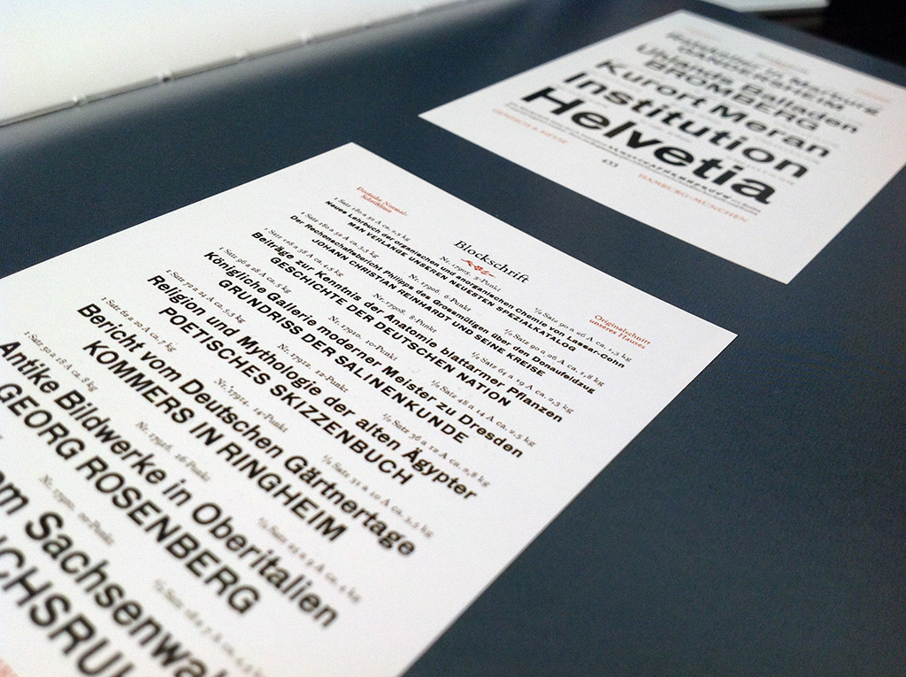
When I came across the Blockschrift typeface in the Book Sans Serif by Cees W. De Jong, I knew I wanted to make my own version of it. Not finding a direct digital version of it online also helped in strengthening my desire to make this into a typeface of my own.

Starting Point for Blockschrift were scans from the Book, which were digitized and traced. Die Blockschrift is an old fashioned German Sans Serif typeface—in fact, it looks very similar to Scheltersche Grotesk, but maybe a bit more clumsy and charming in its execution, something I wanted to carry over into the digitization.
While great care was taken to retain some of the manual charm of the original, die Blockschrift is also firmly based in today’s time.
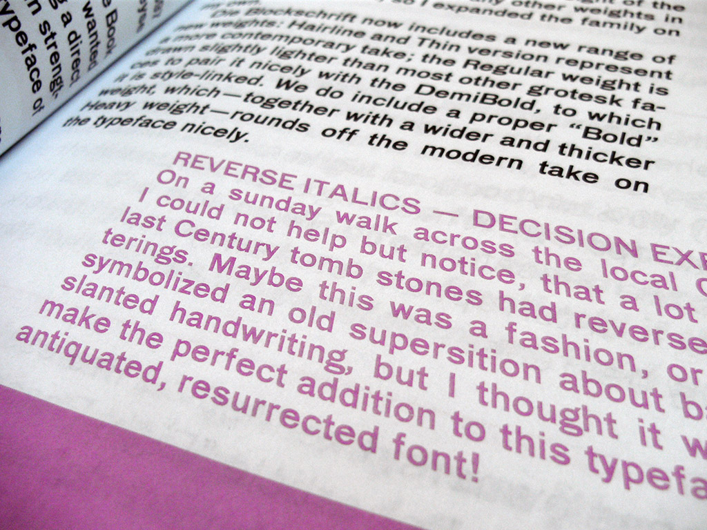
The Original Blockschrift is what you are reading here, a (Demi-)Bold “Halbfett” weight of the type. I did not come across any other weights in my limited research, so I expanded the family on my own.
Die Blockschrift now includes a new range of new weights: Hairline and Thin version represent a more contemporary take; the Regular weight is drawn slightly lighter than most other grotesk faces to pair it nicely with the DemiBold, to which it is style-linked. I also include an ExtraBold weight, which—together with a wider and thicker Heavy weight—rounds off the modern take on the typeface nicely.